Tuesday, March 15, 2016

OUGD402: Appointment Cards


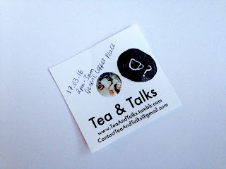
I prefer the last one. The design is the most simplistic. There is enough room to write the date and time then the stamp can be optional. It looks rustic and authentic like an actual human wrote it. I feel if I use the one with the image than it looks unprofessional to hand write the date and time on it.

Feedback:
"I like the one that has no logo. It keeps consistency with your minimalist theme."
"The one with the image would look nice as a business card."
"The concept of an appointment card is nice. Maybe edit the composition more."
"Experiment with the placement of the date, time etc."
"Maybe play with colour?"


No comments:

Post a Comment